Purnabramha
At Purnabramha, I think about how a sense of Maharashtrian identity can come through proportion, material and detail without turning a restaurant into a literal reconstruction.
Maharashtrian references in the present
When I look at Purnabramha, I start with a question about translation: how can a restaurant carry a sense of Maharashtrian identity and still feel contemporary? The design draws from the warmth of Maharashtrian homes and Wada-inspired architectural details. Proportion, detail and material relationships bring those references into a contemporary restaurant setting.
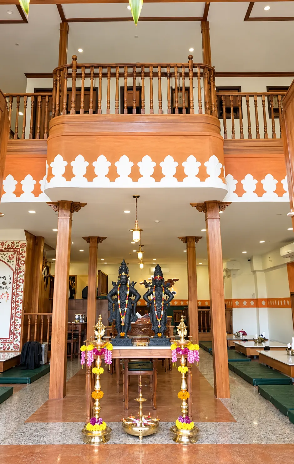
At Purnabramha, the architectural cues sit alongside a double-height dining interior, timber columns and an upper railing. They give the space a familiar register within a contemporary restaurant.
Letting the room keep its scale
The double-height volume is the room’s strongest spatial gesture. It gives the dining room a larger vertical presence, while the tables and chairs keep the experience at an everyday scale. The central display and upper edge offer the eye points to return to as it moves through the room.
I am interested in that relationship between scale and use. A room can be generous without every element needing to become grand. The dining furniture remains legible below the taller architecture, and the vertical features create a setting around the activity rather than competing with it.
Wood, earth and restrained accents
Natural wood provides material warmth in the room. Earthy browns and warm beige build on it, while texture brings variation to the palette. Small brass accents and handcrafted details give the eye closer points of interest, leaving the larger surfaces calm.
The palette also makes room for muted green and saffron. I read those colours as accents within a quieter composition, not as a shorthand that has to announce a cultural identity on its own. When a room is grounded in materials and proportion, a smaller amount of colour can do more work.
Artwork belongs to the dining experience
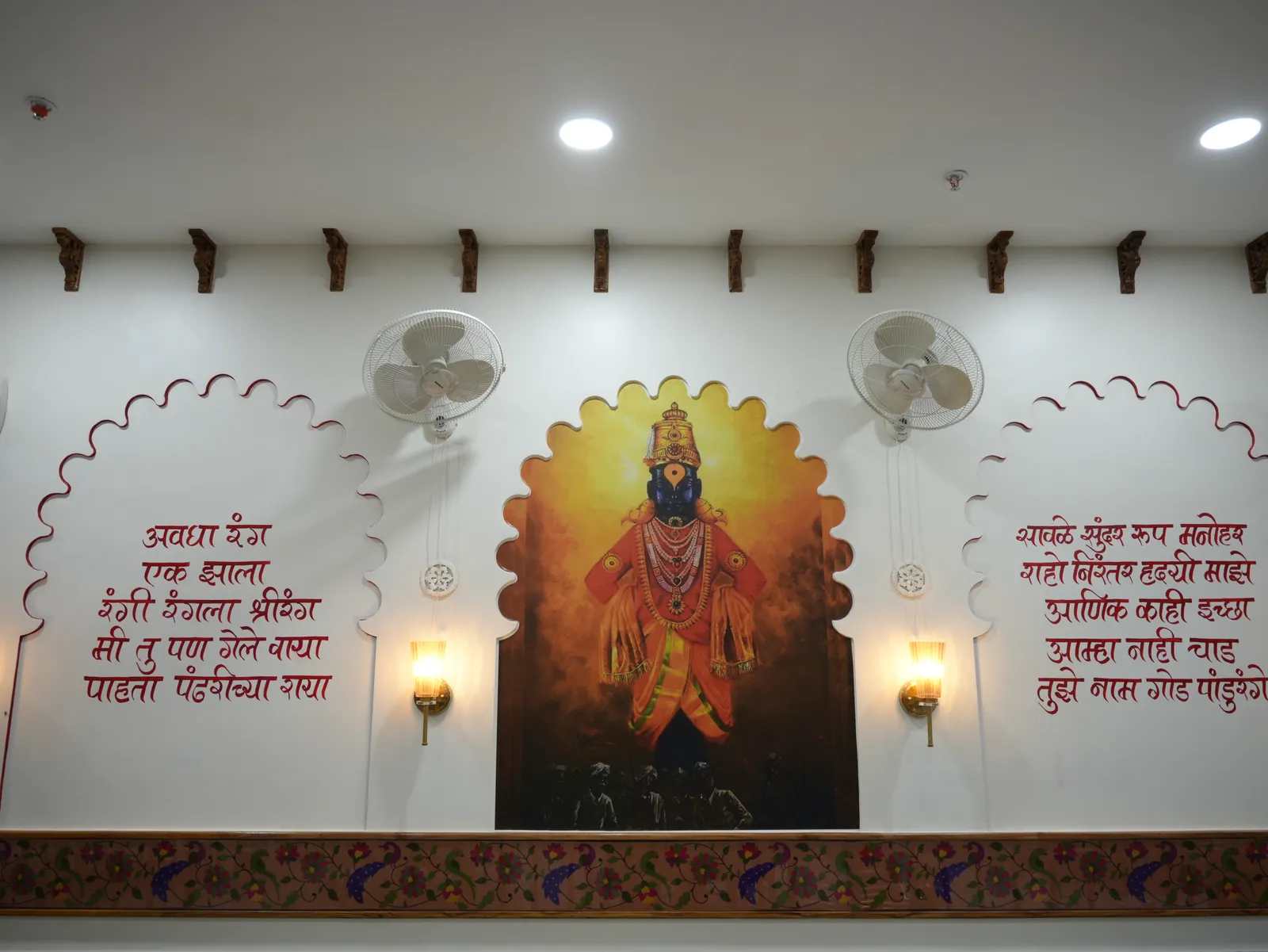
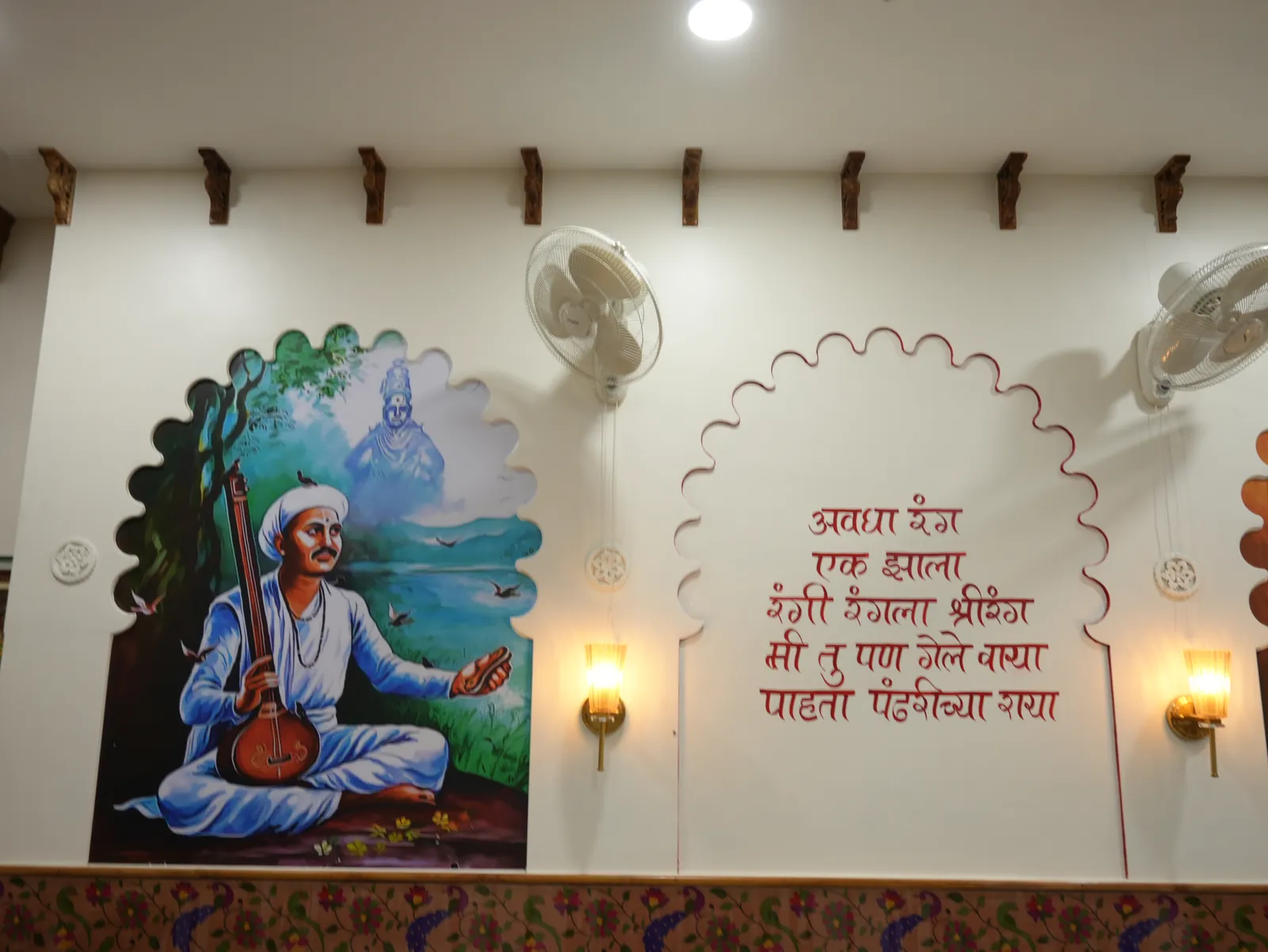
Marathi lettering, devotional imagery and the seated musician artwork create specific visual moments. They are not interchangeable decorations: each image carries its own character and occupies a different place in the room. Against the warm surfaces, the artwork can be read as part of the restaurant’s identity without covering every wall.
This is one way I think about hospitality interiors. People encounter the room while arriving, finding a table and sharing a meal. Artwork can add a point of attention to those ordinary moments, while the architecture and furniture continue to do the quieter work of making the setting coherent.
A contemporary welcome
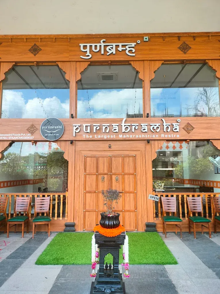
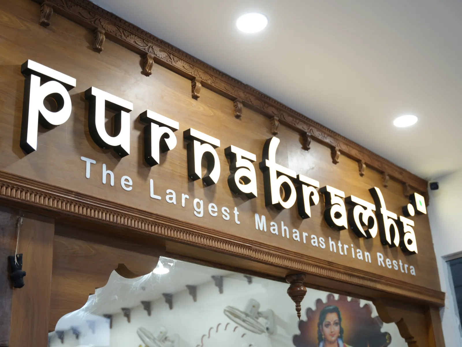
Warm light draws together the wood, earth-toned textures and artwork, giving the tall dining room a unified, intimate glow. At the entrance, carved trim, illuminated signage and timber doors set up the same material conversation before the dining room opens above.
Purnabramha reminds me that a restaurant’s sense of place does not depend on literal historic scenery. Wada-inspired proportions, familiar materials, Marathi visual references and present-day hospitality can coexist. The balance comes from giving each element room to contribute, while keeping gathering—not the reference itself—at the centre.